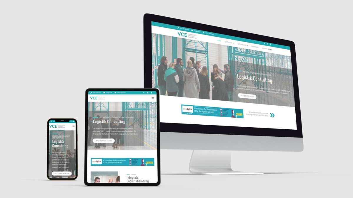
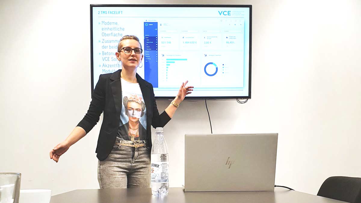
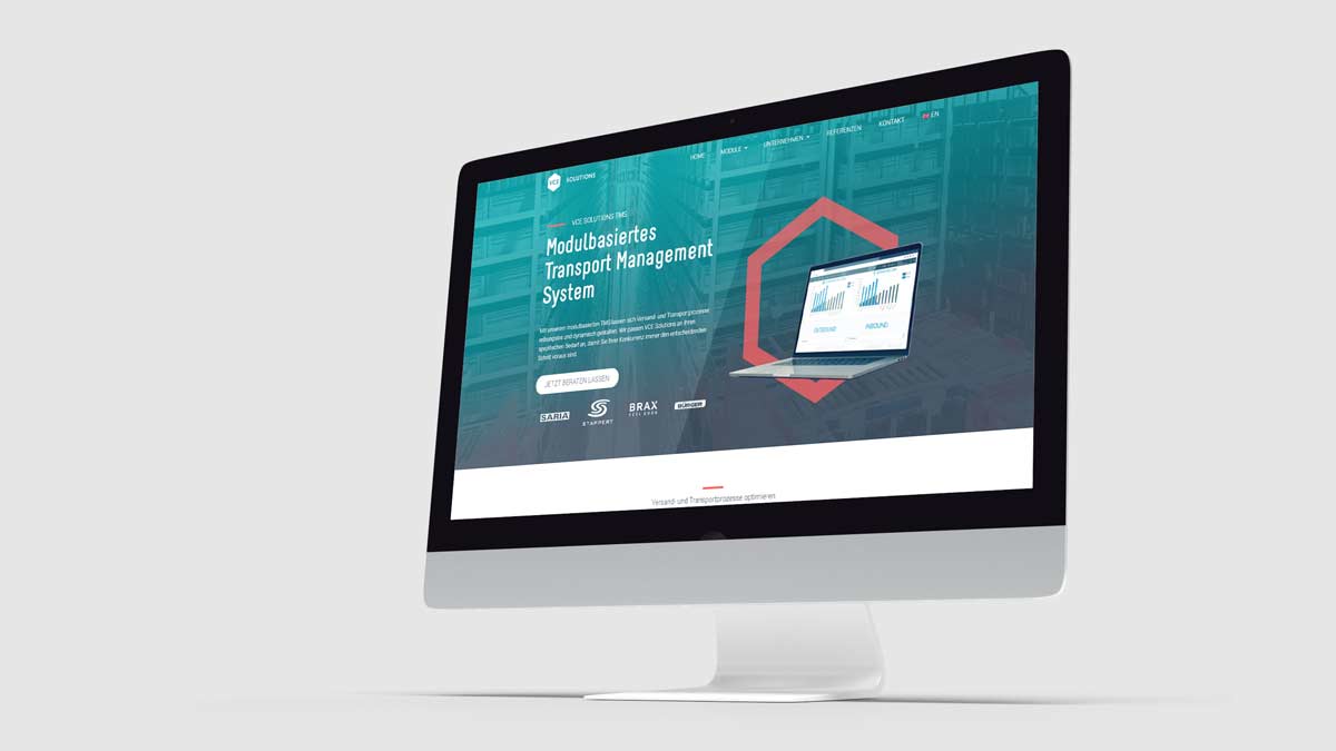
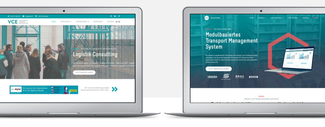
VCE GmbH offers consulting and general planning for logistics projects and also develops its own logistics software. In my role as online marketing manager, it was my job to open up the path to online marketing, as previously VCE had only acquired leads through word of mouth and trade fairs. The first step was to design modern and responsive websites.
Relaunch Consulting Website
What makes a successful website relaunch?
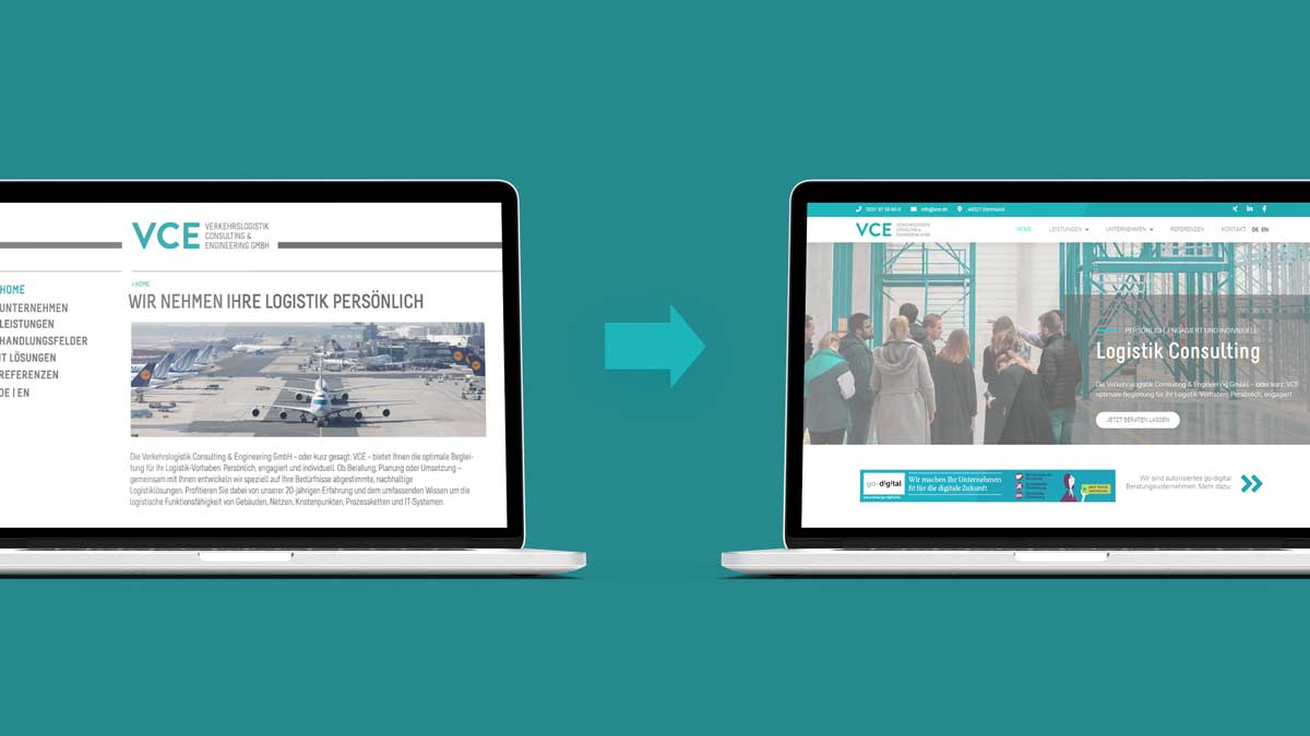
When I started at VCE as Marketing Manager, there was a strong urge for a new website. One of the reasons for this was that the website was not responsive, i.e. it did not adapt to different screen sizes. Since it was already 11(?) years old, so – no surprise. In discussions with the management, it also became clear that the content was not up to date and also not displayed very user friendly. The business has grown over the years and the website hasn’t quite kept up.
The initial situation summarized:
- Page structure of vce.de was confusing
- Some software products could be found under their own domains (frame-solution.de and carma-solution.de) and some were listed on vce.de/produkte/ as subpages.
- The brand font Melbourne is difficult to read as a font for paragraph texts, even though it has an excellent recognition value for the brand
Old and new brand typography for VCE Consulting - which one has the better readability?
Typographie VCE Consulting old design
Typographie VCE Consulting new design
Communicating two strong brand pillars with clarity
In order to better market both consulting services and software, I developed a brand name and a separate logo for the software services and from then on communicated the existing brand VCE Verkehrslogistik Consulting & Engineering GmbH as VCE Consulting.
Once I had decided on the new brand architecture and domain structure together with the management, I started designing the new websites.
Together with my colleagues from logistics planning and IT design, I added missing technical content. Finally, I rewrote the marketing texts and reworked the technical texts to address user needs.
Consulting webdesign relaunch: Project process
We opted for a completely new web design, but retained the matching logo for the VCE GmbH brand, the tried-and-tested brand colors and kept the recognizable “Melbourne” font for headlines only. In this way, the brand remained recognizable, while the readybility and look was greatly improved and modernized.
What we changed and why:
Dispensing with the sidebar and displaying the complex menu in a mega menu
Large images in the header area of each page to appeal directly to the visitor emotionally
More images in the content, matching the corresponding contentRestructuring of the content: As mentioned above, summarize the software products as a separate software brand; easier to understand and more detailed texts on all services and products
Technically clean and future-proof implementation: creation of own Elementor templates and website design based on them, adaptation of HTML and CSS
News area, based on WordPress posts (previously only static news area)
References filterable by industry, which are also visually more appealing thanks to matching industry or customer photos (implementation with user-defined post types)
VCE Consulting & Engineering GmbH now has an up-to-date web presence that presents it as the strong and dynamic company that it really is.
