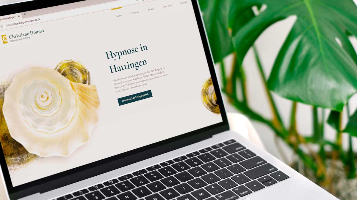
Christiane’s vision is to effectively help people with a technique called self-organizing hypnosis in just a few sessions by showing her clients how to access their subconscious. The client discovers wishes and emotions that were previously hidden from the conscious mind and can thus find the true causes of their problems.
Unlike the widely known suggestive hypnosis, the client finds their own way and explores their subconscious in their own way and at their own pace and also creates their own solutions.
After Christiane had already worked with me to find her logo and her entrepreneurial identity, we now turned our attention to her website.
“For many people, seeking help is a big step. Hypnosis in particular is something that many interested people spend a while thinking about before they decide to contact me. I think a website that reflects my way of work would help to build trust,” said Christiane, when we started the website project.
What makes a good coaching website?
The goals of the website for Christiane were to build trust, show her own entrepreneurial personality and encourage interested visitors to contact her.
The following factors play a decisive role in achieving these three goals:
- The look and feel of the site
- Content (texts and photos)
- The page structure and certain elements contained therein that make it easy for the prospective customer to find the contact form or telephone number as soon as they are ready
Christiane and I started with the content workshop. In this workshop, I showed Christiane how to write website copy. She learned how to pick up her prospective customers where they are at the moment with her texts and give them exactly the information they need to decide to get in touch.
In a second workshop, we developed a precise briefing for the visual design. Christiane already had a logo, colors and fonts from the logo & branding project, but web design is much more than that. Web design is an extension of identity design, so to speak. We looked at sample pages together and discussed which design features visualize what Christiane wanted to communicate. This process always has the potential to find out what someone wants to communicate and what someone can identify with.
sample of a layout that conveys a lot of stability
sample of a more dynamic visual flow
Here’s an example: I asked Christiane whether the design should rather convey stability or dynamic. Christiane spontaneously decided in favor of stability. I showed her examples of designs that I felt were more stable. Then I showed her examples that had a certain dynamism to them. Surprisingly, it turned out that she didn’t like too much the rather stable examples and that she particularly liked a more dynamic example. And that turned out to suit her perfectly.
Finding a common design language with the client
It’s not really important what terms we use, but what we mean by them. So the client and I have to find a common language. We have to define what we mean when we say “modern” or “dynamic”. I use a few tried-and-tested pairs of terms that help me a lot in the design process and clarify them with the customer. These include “dynamic – stable”, but also, for example, “technical – emotional” and a few more.
We implemented the design principle that Christiane particularly liked in her website:

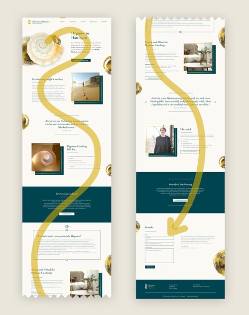
“Dynamic” does not necessarily mean “wild”. In Christiane’s case, it rather means a smooth, uninterrupted flow of reading. We achieve this here by using a continuous background color, which is only replaced by a different background color for really highlighted sections, and by alternating the image-text arrangement: left-right and right-left. In this way, the reader’s eye is guided through the page like a gently meandering stream.
Why does this fit so well with Christiane and her work? Stability is a desirable mental state – wouldn’t that be something for a coach’s or therapist’s website? Yes, it certainly could be. For Christiane, however, this gentle reading dynamic is so appropriate because it creates a similarly gentle feeling of flow as a mindful journey through one’s own subconscious. And this is exactly what Christiane enables her clients to do. She shows her clients how to explore the flow of their (inner) life.
A small counter-example: a project management consultant may prefer to prioritize structure and order. One principle is not better than the other – the design process is just about translating the respective vibes perfectly into a visual language.
The client about this project:
....... I'm so glad that I got professional support for the logo and website and didn't have to fiddle with it myself. The whole process was super structured and very transparent. I felt totally welcome with my wishes and goals because you listen very carefully and ask very good questions. The website really reflects who I am with my business.
